
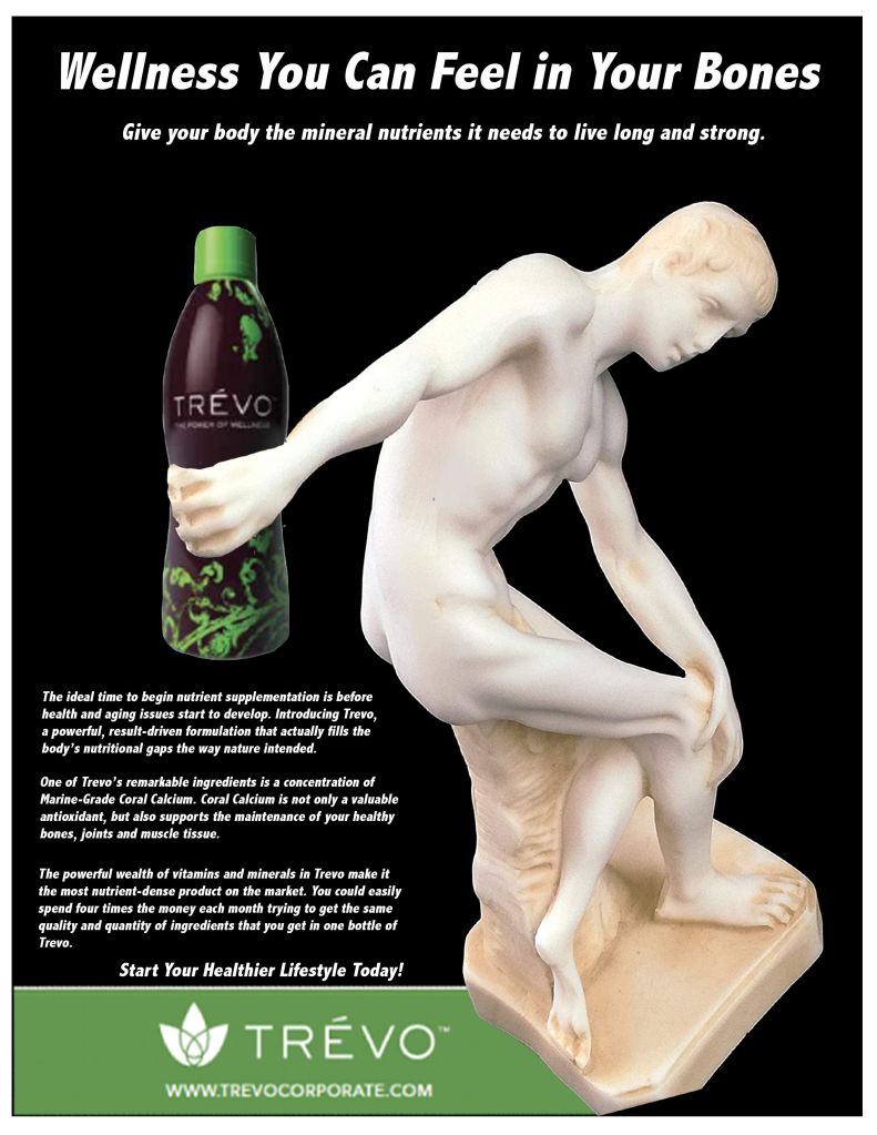
I began the process by looking at advertisements to see which one attracted my attention enough for me to work on a redesign. I searched for a print media involving fitness ads that interests me. And then I redesigned it using a well-known image of Discobolus Discus Thrower Greek Statue from art history as the visual element. My procedure of removing the background of the photo that I had chosen from google was to take out everything that was not required by using the magnetic tool in the Adobe Photoshop. I was done with the background being deleted of the Discobolus Discus Thrower Greek Statue photo. The advertisement was about a Vitamin juice drink named Trevo. So I put the bottle of Trevo in the Discobolus’s hand. I combined the ad with greek statue and I came up with my first round of thumbnails. I redesigned the ad by making Discobolus Discus Thrower Greek Statue hold the bottle of Trevo which more effectively communicates actually being advertised because the design is eye catchy and people will definitely try the product for their fitness.
The Discobolus Discus Thrower Greek Statue from art history relates to and supports the print ad of Trevo because that greek statue was already holded something in hand so I just replaced the object with a Trevo bottle. I thought Discobolus Discus Thrower Greek Statue holding the bottle of Trevo would work well in the space of the design. When I finished working on them and saw the redesign of the ad I liked it more than the original ad. Historical statues are good for fitness advertisement because statues are very well structured and everyone is attracted to a well shaped body.
I learned how to establish and use a simple grid to organize and align elements to be arranged in a visual and informative hierarchy. I was composing the elements visually by emphasis, contrast, balance, repetition, alignment and flow. I used a headline, subhead, body copy and visual elements. For example, I tried not to do Insufficient contrast because it can make text content in particular very difficult to read, especially for people with visual impairments. I kept my design very simple and balanced so that everyone can understand the theme of the design. While working with this, I tried to keep in mind the Rule of Thirds to make sure everything aligned properly. As I was viewing the design, I was assuring if I can see the sculpture image primarily centered within the four points.
