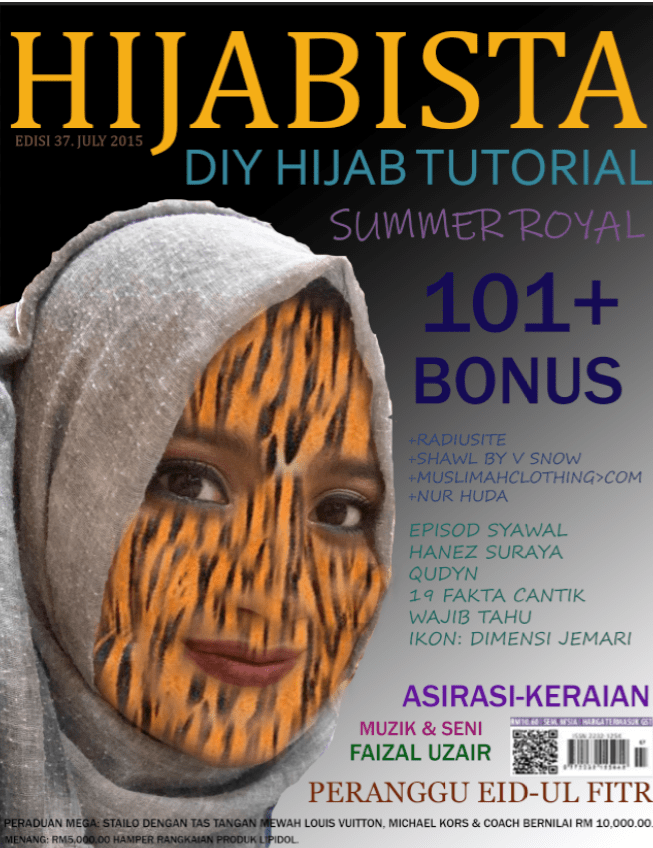
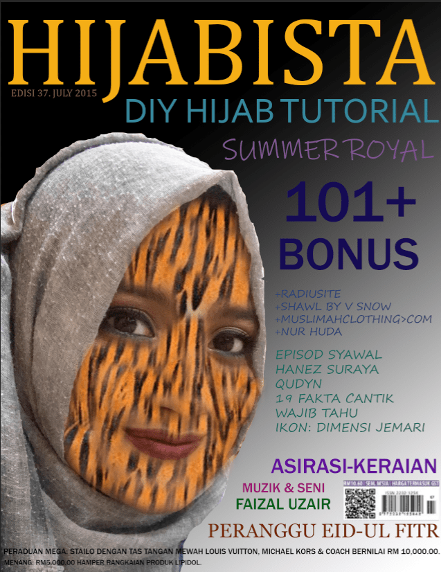
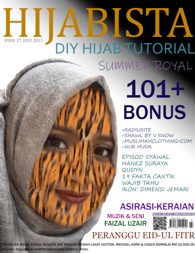
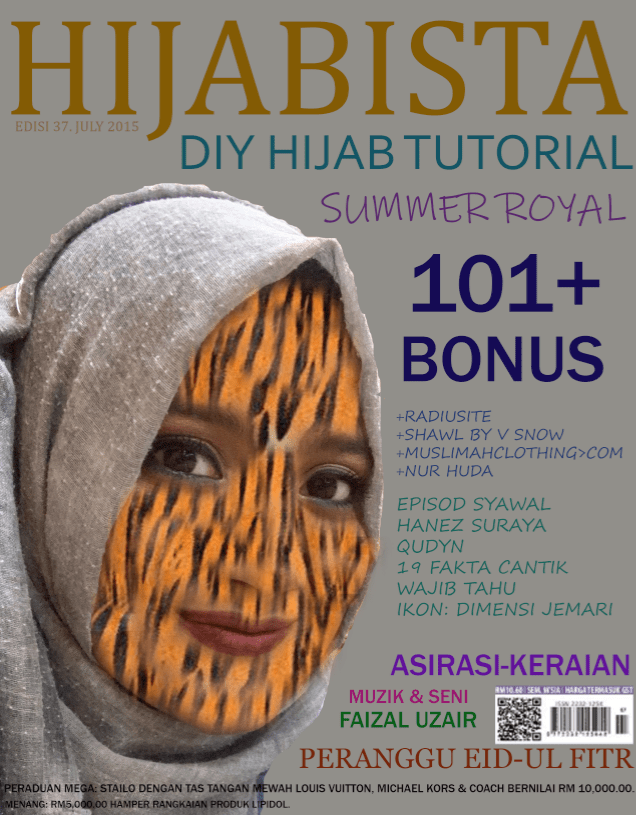
Final Magazine Cover Redesign, due 05/18/20

34. Describe the six questions or areas you must address when meeting with your client?
The six questions or areas I must address when meeting with my client are target audience: internal like workers of the company or external customers, age, geographic location and gender. For messages it can be something as simple as thanking customers and/or announcing a new product. For specifications we need to find dimensions, number of pages, paper stock and size of the print run. For a budget if a client has a specific budget in mind and tells us, it can help to determine the scope of the project and our final cost to calculate our estimated hourly rate. For the deadline we have to find out if the project needs to be done by a specific date. Creative direction can be colorful, fonts, works of art, other designs and websites.
31. Describe three types of graphic design portfolios.
The three types of graphic portfolios are a web page of graphic design portfolio is easier to spread, PDF of graphic design portfolio is easier to email and authority browser, outstanding portfolio is fine for showing off and to use for professional means.
32. Describe five ways for promoting your graphic design business.
Five ways for promoting graphic design business are get credit line on graphic design projects, make business cards, encourage frame of reference, make social media and make blogs.
33. If you started your own graphic design business what approach would you use to set your rates/prices?
If I started my own graphic design business then I would set low-priced for the business in the beginning and once I got a bigger contract then I would raise the price gradually.
30. Post one of your designs that you believe you have successfully paired two styles of fonts, and describe how the font styles complement one another.

For this design I used the fonts Montserrat and Abril Fatface. These font styles compliment each other with their contrasts. Montserrat really shines for short pieces of all caps and the geometric simplicity of the letters while Abril Fatface is thin and thick serifs and clean curves lend the typeface.
DESIGN AND THEN POST an informative infographic that visually depicts / illustrates visually pleasing typographical pairing. (#6 design you create on your own time)

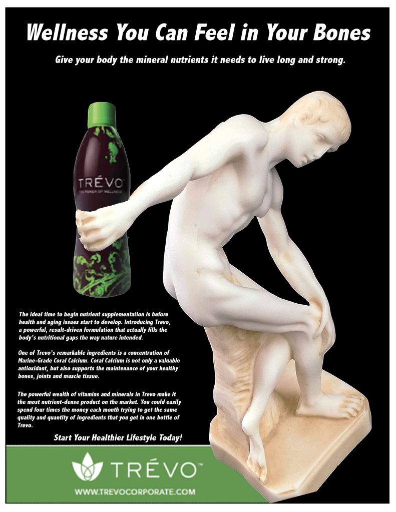
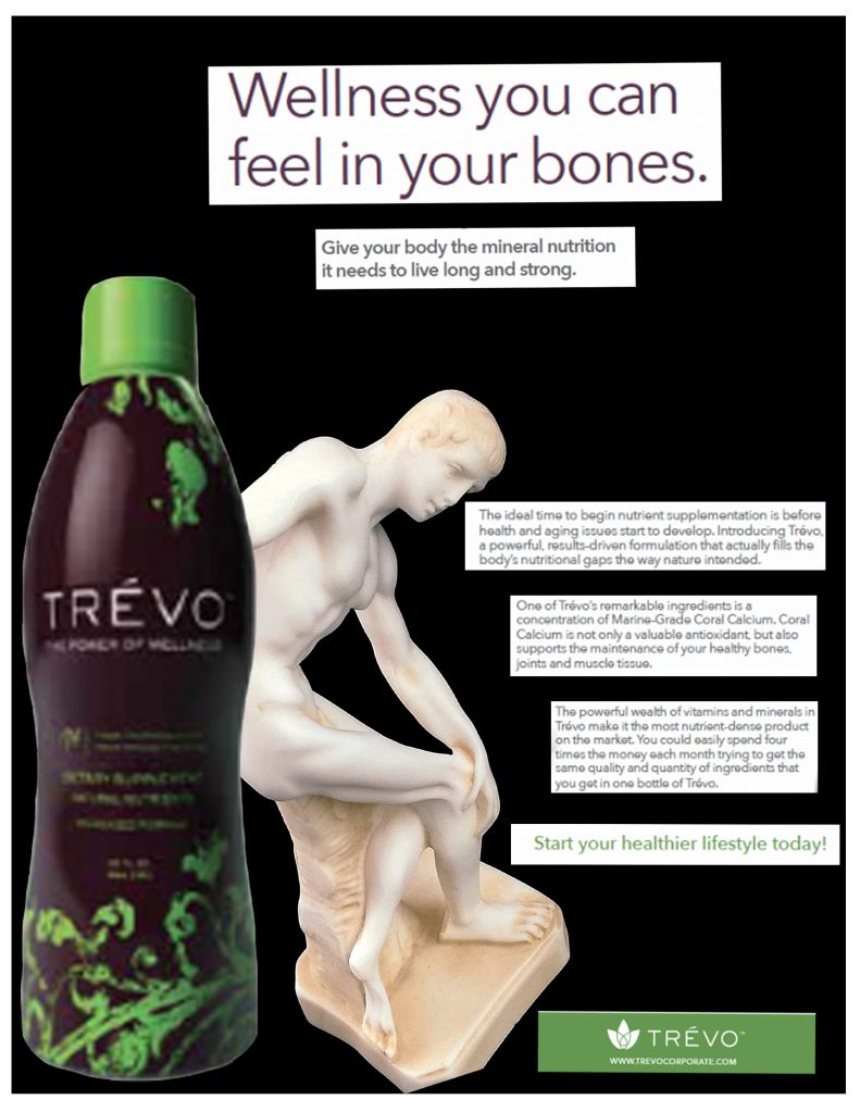
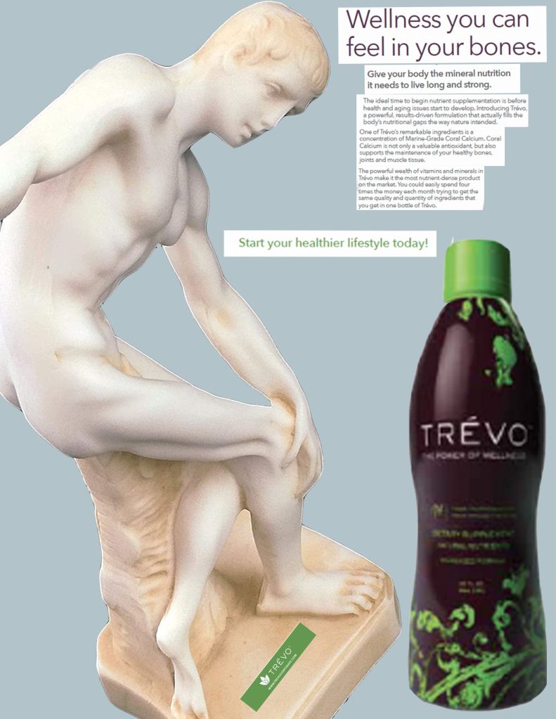
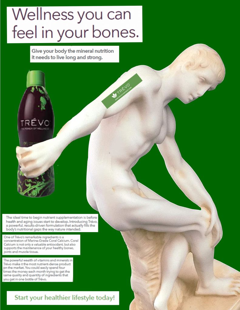
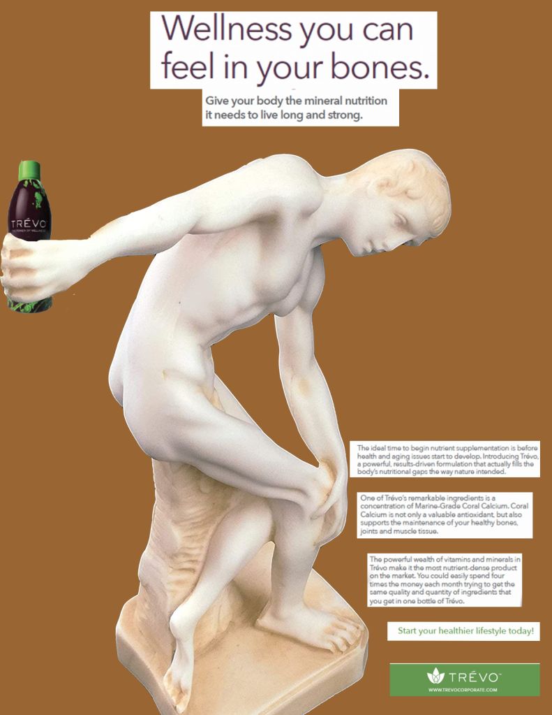
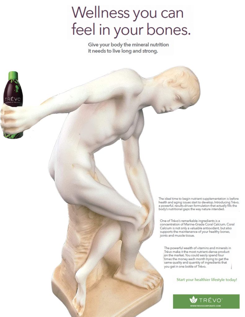
I began the process by looking at advertisements to see which one attracted my attention enough for me to work on a redesign. I searched for a print media involving fitness ads that interests me. And then I redesigned it using a well-known image of Discobolus Discus Thrower Greek Statue from art history as the visual element. My procedure of removing the background of the photo that I had chosen from google was to take out everything that was not required by using the magnetic tool in the Adobe Photoshop. I was done with the background being deleted of the Discobolus Discus Thrower Greek Statue photo. The advertisement was about a Vitamin juice drink named Trevo. So I put the bottle of Trevo in the Discobolus’s hand. I combined the ad with greek statue and I came up with my first round of thumbnails. I redesigned the ad by making Discobolus Discus Thrower Greek Statue hold the bottle of Trevo which more effectively communicates actually being advertised because the design is eye catchy and people will definitely try the product for their fitness.
The Discobolus Discus Thrower Greek Statue from art history relates to and supports the print ad of Trevo because that greek statue was already holded something in hand so I just replaced the object with a Trevo bottle. I thought Discobolus Discus Thrower Greek Statue holding the bottle of Trevo would work well in the space of the design. When I finished working on them and saw the redesign of the ad I liked it more than the original ad. Historical statues are good for fitness advertisement because statues are very well structured and everyone is attracted to a well shaped body.
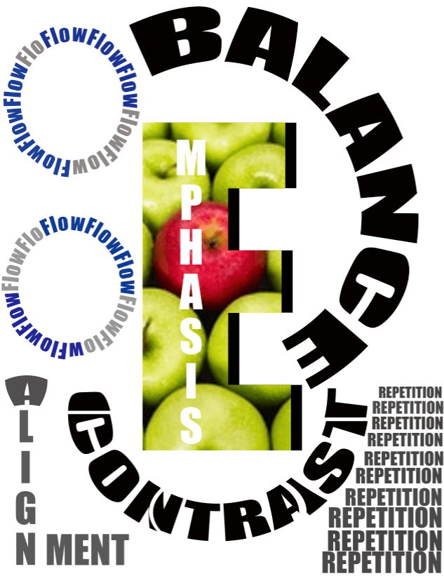
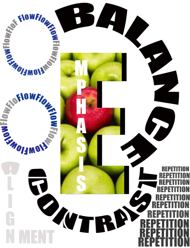
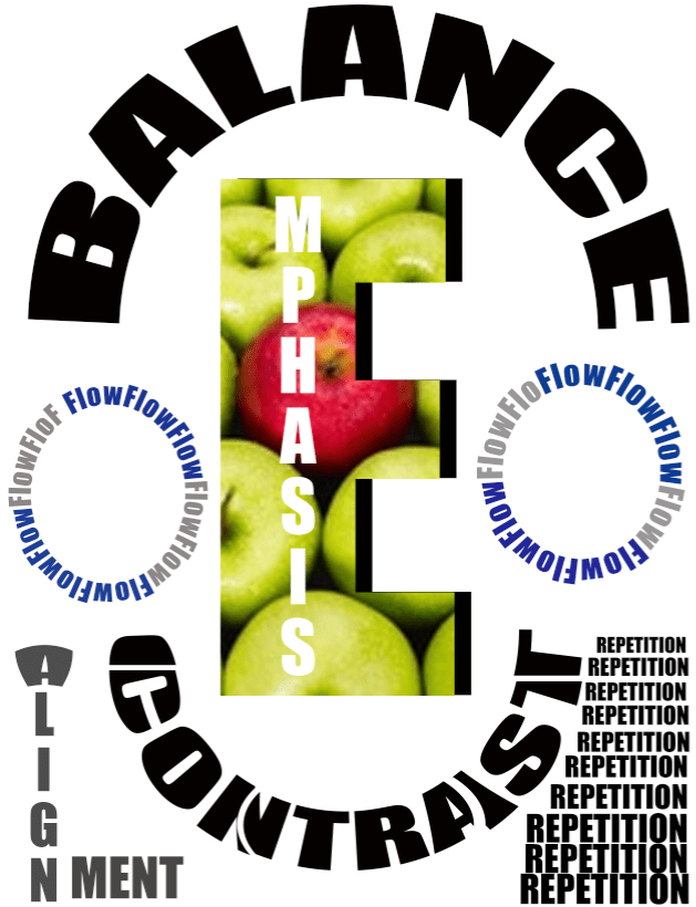
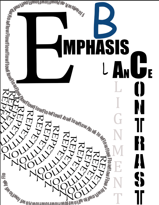
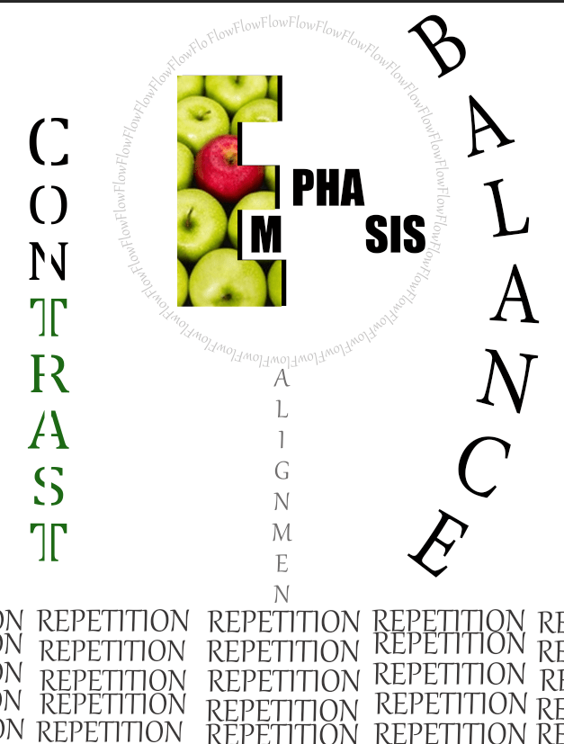
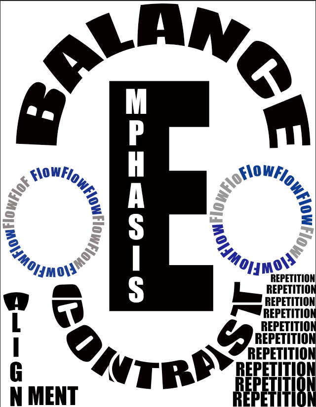
I learned how to establish and use a simple grid to organize and align elements to be arranged in a visual and informative hierarchy. I was composing the elements visually by emphasis, contrast, balance, repetition, alignment and flow. I used a headline, subhead, body copy and visual elements. For example, I tried not to do Insufficient contrast because it can make text content in particular very difficult to read, especially for people with visual impairments. I kept my design very simple and balanced so that everyone can understand the theme of the design. While working with this, I tried to keep in mind the Rule of Thirds to make sure everything aligned properly. As I was viewing the design, I was assuring if I can see the sculpture image primarily centered within the four points.
23. What is the little round thing at the very bottom of this letter “y” called?
The little round thing at the very bottom of this letter “y” is called descender.
24. What is the center of this letter “O” called?
The center of this letter “O” is called counter.
25. What is the little round thing at the top, right of this letter “r” called?
The little round thing at the top, right of this letter “r” is called arm.
26. What is the left side of this letter “h” called?
The left side of this letter “h” is called stem.
27. What is the overall height, from top to bottom, of the letter “H” called?
The overall height, from top to bottom, of the letter “H” is called cap height.
28. What is the overall height, from top to bottom, of this letter “x” called?
The overall height, from top to bottom, of this letter “x” is called x-height.
29. Design an informative infographic that visually depicts / illustrates typeface anatomy. (#5 design you create on your own time)

19. Post an example of a design where Garamond was used, and describe below the post three characteristics of the Garamond font.

The three characteristics of the Garamond font are soft rounded serifs, medium contrast and flag shaped top serifs.
20. What makes the Transitional font different from Garamond?
The thing that makes the Transitional font different from Garamond is Transitional changes from one form more in broadness and thinness in its lines.
21. Post an example of a design where a Helvetica font was used, and describe how this choice of font visually enhances the design.
https://logotyp.us/logo/jc-penney/
The font looks very eye-catching because it looks organized. It also matches the simplicity of the bullseye because of the red color.
22. DESIGN AND THEN POST an informative infographic that visually depicts and distinguishes the five classic typefaces. (#4 design you create on your own time)

16. What does typography refer to?
Typography is the artwork and method of arranging type to make written language clear, readable and engaging when displayed. The arrangement of type requires selecting typefaces, line-spacing, and letter-spacing, and adjusting the space between pairs of letters.
17. Describe three characteristics of font (or typography), and post examples of each of these.
Lines – Typography has at least 5 lines to remain in the sequence and balance.
https://www.webfx.com/blog/web-design/the-basics-of-typography/
Spacing – Typography has the space between letters and words.

Alignment – Typography has the way to impact on how people will read it.
18. Describe five (5) characteristics of typography. DESIGN AND THEN POST an informative infographic that visually depicts the five (5) characteristics of typography. (#3 design you create on your own time)
The five characteristics of typography are hierarchy(hierarchy is to assist the ideas should be organized), contrast(contrast makes text interesting and can help you communicate which ideas highlight), consistency(What should go before and after to avoid messiness), whitespace (the empty space around objects or text) and color(the mood of the design).

12. Describe three (3) skills that graphic designers have that distinguish them from other people?
Graphic designers operate inside the creative restrictions that clients offer them, so that all standards are met, also design fixed conditions in order to convey a feeling or experience, and use visual instruments to design solid goals.
13. Post an example of a type and image-based design, and describe three (3) areas that could be enhanced.
I really like the way it is designed. But there is always something to revise the work. Firstly, the way “Money” is designed, it is hard to read so it could be type differently because that is the first letter to read to understand the topic. Secondly, I am not quite sure about the message in the lips so it could be written more clearly. Finally, It would be good to use black for the background to grab people’s attention.

14. Describe the eight (8) steps or phases that are involved in the creative process. DESIGN AND THEN POST (design #2) an informative infographic that visually depicts the eight (8) phases of the creative process (#2 design you create on your own time)
The eight stages of the creative process are as follows:
1.) a goal that begins the entire procedure.
2.) Gathering details for the goal, generally from clients.
3.) Make a general description.
4.) Offer a plan.
5.) Exploit inventive energy.
6.) Draw and build up piece.
7.) Sketch several versions.
8.) If necessary do revision.

15. When “gathering information” during step #2, what are the eight (8) questions you must ask?
When gathering the information questions that should be asked are:
1. Who is the audience for this project?
2. What are the measurements of the materials?
3.What is the budget of the project?
4. What is the deadline for the project?
5. Does the client already have a design in their mind?
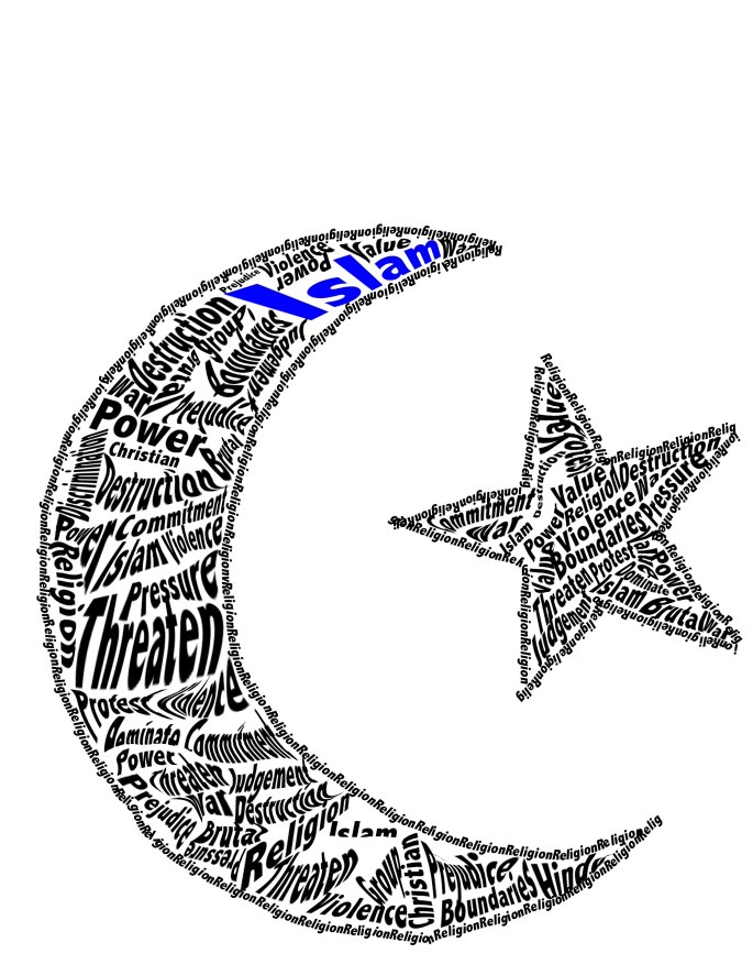
When I saw the options of the “Most Serious Problem” in the assignment paper. I was sure to choose religious conflict because for me it is a big problem in our life. I tried to find words and symbol that relate to my religion, Islam. The concept behind my design is to show other people that I love my religion more than anything even if we face so many problems because of religion. I also want people to see that religious conflict is a big issue through my designs.
My design follows the rule of thirds because my design imagined as divided into nine identical parts by two equally positioned horizontal lines and two equally positioned vertical lines. And that important structured portions placed along the lines or crossings. The technique ranged the issue with simply centering my design and helped to place my design in the right way to be focused based on the issue’s topic. The focal point of my design placed base on the rule of thirds which is more attractive.
My design leads view from the focal point(main idea) to the second and third most important terms by colors and font size of the letter. I tried to focus on the color that should be my focal point because people watch the thing first that is colored. Then I changed the font size of the letter to get second and third most terms because that’s how it will lead people to look for each word and they will understand the theme of my design. It is very hard to lead people through the words because each person sees differently. But I tried to make my design clear to lead through each important word of my design.
9. Describe what the “Rule of Thirds” means? DESIGN AND THEN POST your own infographic that illustrates what the “Rule of Thirds” refers to. (#1 design you create on your own time)
The Rule of Thirds is a method in which it separates the whole artwork into nine equal blocks. This is done by adding two horizontal lines dividing two vertical lines at equal distance. By that means we receive four dividing points. These four points are considered to be the focal points. All the important elements or the main subject should be placed on these lines or intersecting points to be focused.
10. Why do graphic designers consider the “Golden Ratio” when designing?” Post an example of a design that is based on the “Golden Ratio.”
Graphic designers consider the “Golden Ratio” when designing because it attracts the whole design and it also gives a more natural look to the design.

11. What does page layout refer to, and how does a grid enhance the readability of a page layout?
Page layout refers to positioning the parts on a page normally mentioning certain positions of image, text and style. A grid enhances the readability of a page layout by designing a powerful structure, and designing a visual scale.
6. What types of organizations do Visual Communication Designers work for?
The types of organizations Visual Communication Designers work for are Internet and Software Development Organizations, Advertising Firms, Television Studios and Video Production Organizations, Corporate Branding and Consultation, Publishing Industry.
7. Describe three (3) types of business within Broome County that require the services of Visual Communication Designers, and what the specific role of the designers may be?
Three types of business within Broome County that require the services of Visual Communication Designers are Restaurants, Dental Office and Grocery Store because all these need something visual design in their business for good purpose. The specific role of the designers for restaurants might be to make a logo design because that is the first deciding step in attracting customers. The specific role of the designers for the dental office might be to make the office look interesting and good with different graphic design because usually, dental offices are boring, dull and colorless spaces for some of the people. The specific role of the designers for grocery stores might be to bring attention to the customers towards posters that designers create for the store for more advertisement of the products because seller wants to sell more things.
8. In your opinion, how is the field of Visual Communication Design evolving?
The field of Visual Communication Design is evolving through the customers or audience view and response. The main point of view for a visual designer to show his/her customer a visual image of a product if a customer gives a good response then it is a good visual image. But if the customer gives a bad response then there is always a way to improve. When a designer gets a good response from a customer or audience then he/she gets inspired to make more designs. We need Visual Communication Design in every field of business because people like to show their customers something visually representing their business.
1. In your own words, what is graphic design and what are a few common examples of visual products that graphic designers create? Post an example of three different types of graphic design products, and describe what the purpose of each is. Describe what aspects of the designs make them visually compelling?
Graphic Design is to make designs on multimedia programs and convey ideas visually in the best way possible. The designs are drawn by hand or created through computer software. These designs can be in the form of an image, typography, and video which are used to communicate ideas.
Movie Poster Design

The main purpose of a movie poster is to publicize and inform the audience of an upcoming film through important information such as release date, actors and particularly with reference to age. I really like the body language and facial expression of the movie poster that makes the audience curious about the movie.
Banner Design

The purpose of a banner is to announce a specific product and draw attention to as many people as possible. It is the ideal way to attract all the people who may be interested in a particular object from the store but are uninformed from the online marketing and is not a regular customer of the internet. They can easily be attracted towards that product. I really like the banner with a huge percentage of sales. The designs make visually compelling as it manages to attract the human eye with just a single look and this banner is attractive enough to gain attention because it shows up 50% off which is a big sale for customers.
Book Cover Design

The purpose of a book cover is to attract the readers and then get those readers interested enough to check the book and learn more about the book, which helps the author to get more book sales. I like this book cover because the design is very eye catching to me as it has both writing and drawing in a creative way.
2. Post an example of an innovative image-based design and describe what attracted you to this design. An image-based design is a graphic design piece that is completely based on an image. (i.e. photograph, illustration, drawing, painting, etc.)
Plant-Based Primer: The Beginner’s Guide to a Plant-Based Diet
I was attracted to this design because designers created this image to represent the idea of diet chart that humans need to follow for good health. Images are extremely powerful and convincing tools of communication. It conveys not only information about food items but also diet charts for human’s good health. This picture inspired me to follow that chart for my daily life.
3. Post an example of a type and image design and describe what is the center of attention or area of emphasis. (The area that stands out and that you look at first; in other words, the focal point!) A type and image design includes both an image(s) and type. For example, a poster, billboard, magazine cover, etc.

The center of attention or area of emphasis is “Jazz Concert” because in the poster “Jazz Concert” is written in a big font which shows that the people who created this poster want others to know about the concert event.
4. Post an example of a logo or symbol that you find visually appealing and describe how the form of the design expresses its content. (In other words, how does the logo or symbol symbolically communicate a message?)

Symbol is a way of exchanging messages between the sender and the receiver. Target logo is attractive to me because when I look at it, I feel like something is moving from something broad to deeper. I think the logo or symbol symbolically communicates a message that chose the object wisely. I think this symbol is attractive for using it in a company because the company logo should be simple but catchy to customers. Target logo is catchy to me so I think this logo is attractive.
5. Carefully study the AIGA, the Professional Association for Design, and described five (5) things that you’ve learned from studying the web site.
Five things that I have learned about 2019 Design Census from studying the web site are


